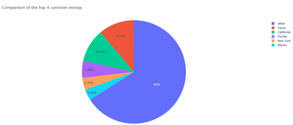
Homework 2
Python
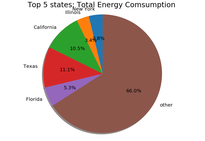
This is a pie chart for the top 5 states which consume the most energy. It is noticed that California and Texas both consume about 10% of the total energy.
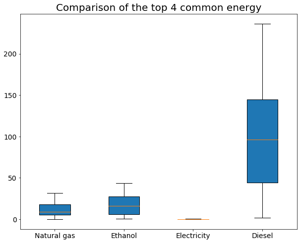
This is a boxplot graph which describe the distribution of the top 4 most commonly used energy. It is noticed that Diesel has the largest variance between different states while electricity has the lowest variance among states. It implies all states consume simlar amount of electricity, but some states cosume much more diesel than the other .
R (ggplot)
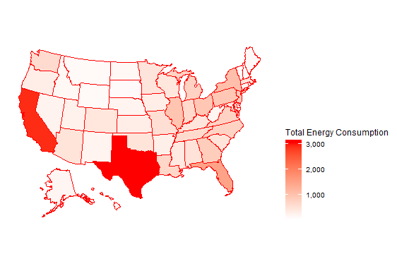
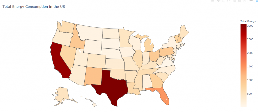
This is a map which describes the total energy consumption of different states, with the higher the total energy consumption, the darker the color is. It is noticed that Texas and California consumes the most total amount of energy.
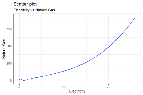
This is a scatter plot that describes the relationship between Natural Gas and Electricity. It is noticed that there is a positive relationship between the consumption of these two energy. It implies that if a state consumes more electricity, it is more likely to consume more natural gas.
Plotly
This map demonstrates the Total Energy consumption across the country. It is the same as what I posted before using R (ggplot).
This is a pie chart for the top 5 states which consume the most energy. It is the same as what I just posted using Python Matplotlib.
